A Brand Built on Healthy Habits
THE STORY
Well Rooted (est. 2021) is a health & wellness coaching business that builds lasting personal habits for peace, health, and happiness. After burning out from years of working in social work, counseling, and mental healthcare, the founders realized many people lacked the education necessary to build their personal health. A community purpose was born, the wellness seed was planted, and Well Rooted sprouted into a new empathetic corner of the telehealth market.
THE BRIEF
Well Rooted envisions itself as a deeply personal and tangible experience for people struggling with physical and mental health. Self-described as "a warm embrace and new dawn for people searching for healthy habits", Well Rooted desired a brand identity that exuded a natural and grounded presence, promoted homegrown self-care, and communicated boundless potential to start newer, healthier, lifestyles.
VISUAL IDENTITY • LOGO DESIGN • BRAND STRATEGY • SOCIAL MEDIA MARKETING
LOGO DESIGN
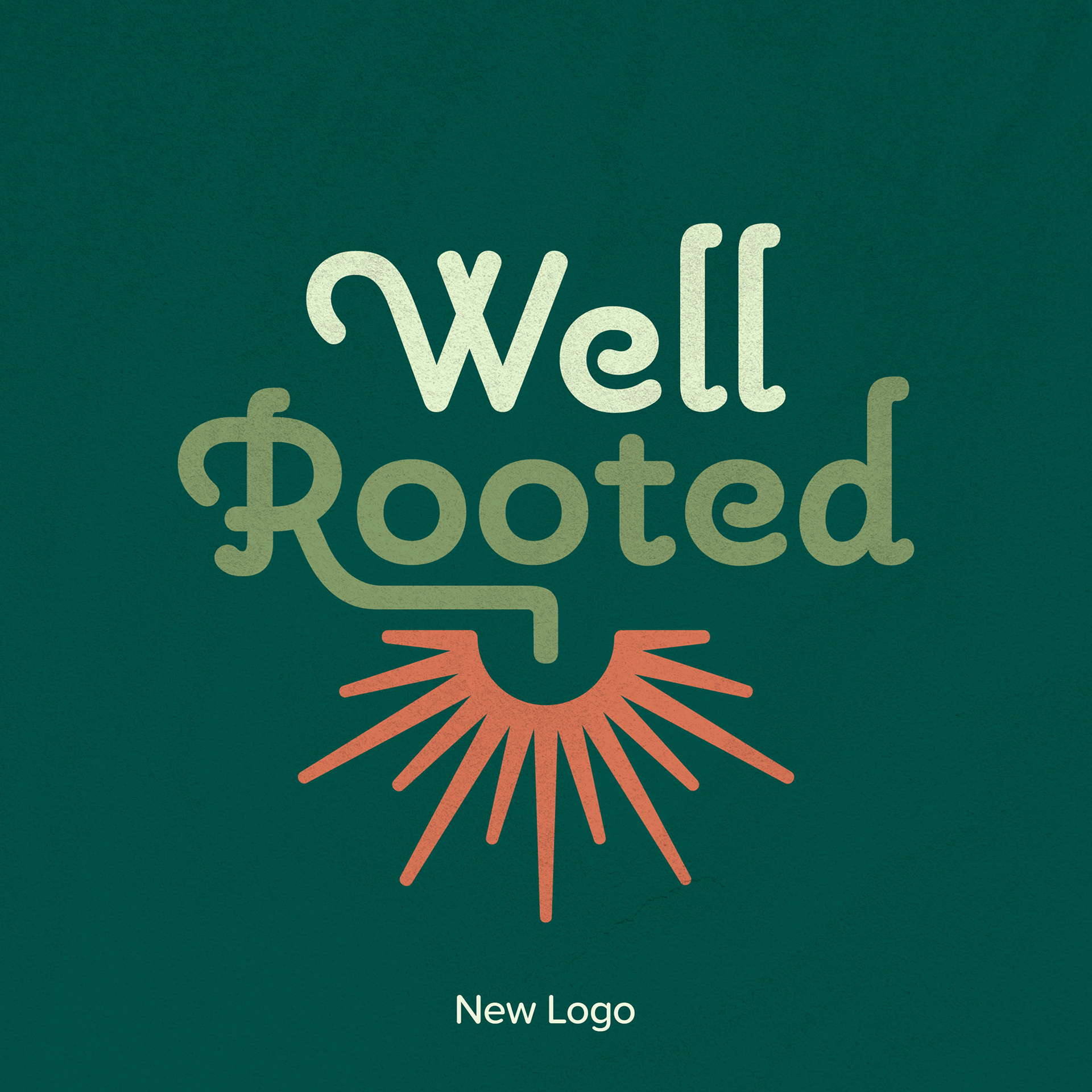
Logos: The Root of a Sunrise
THE CONCEPT
Well Rooted's logomarks were born from the brand's warm vision for health coaching: building new life and sustainability through empathy. Ben visually distilled the brand's ethos into two visual ideas-- seedling roots resembling a rising sun, and a pair of hands in embrace. The "sunrise roots" symbolized the advent of a newer, healthier day, while the hands effused care, embrace, and delicate affection, effectively communicating a personal sense of trust that Well Rooted deemed essential to the core of their business.
THE LOGO FAMILY
In order to design a dynamic yet consistent visual identity, Ben built Well Rooted a collection of marks, each meant for particular uses, plaforms and spaces.


