
BRAND IDENTITY | VISUAL IDENTITY | DIGITAL MARKETING | ADVERTISING | SOCIAL MEDIA
BUSINESS ETHOS
DATA-FOCUSED.
RELATIONSHIP-DRIVEN.
INTRODUCTION
Blue Peak Real Estate is a digital brokerage redefining multifamily leasing by blending cutting-edge data insights with genuine relationship-building. Unlike traditional firms that rely solely on numbers or impersonal tactics, Blue Peak takes a holistic approach—leveraging valuable market data while prioritizing the human connections that drive long-term success. The brokerage hired Ben to build their brand, their marketing strategy, and market presence from scratch.
BUILDING A BRAND FROM SCRATCH
Ben's approach to Blue Peak Real Estate took an unusual shape early on, as the brokerage maintained no sense of brand or marketing beyond the scope of the technology they were building. How do you sculpt a brand from nothing?
Blue Peak's product is highly original. It is a unique programmatic marketing SaaS platform that pairs immediate & concurrent leasing/property information with consumer data profiles. Ben's approach was to study the product, the real estate tech market, and identify the positioning and identities of their competition.
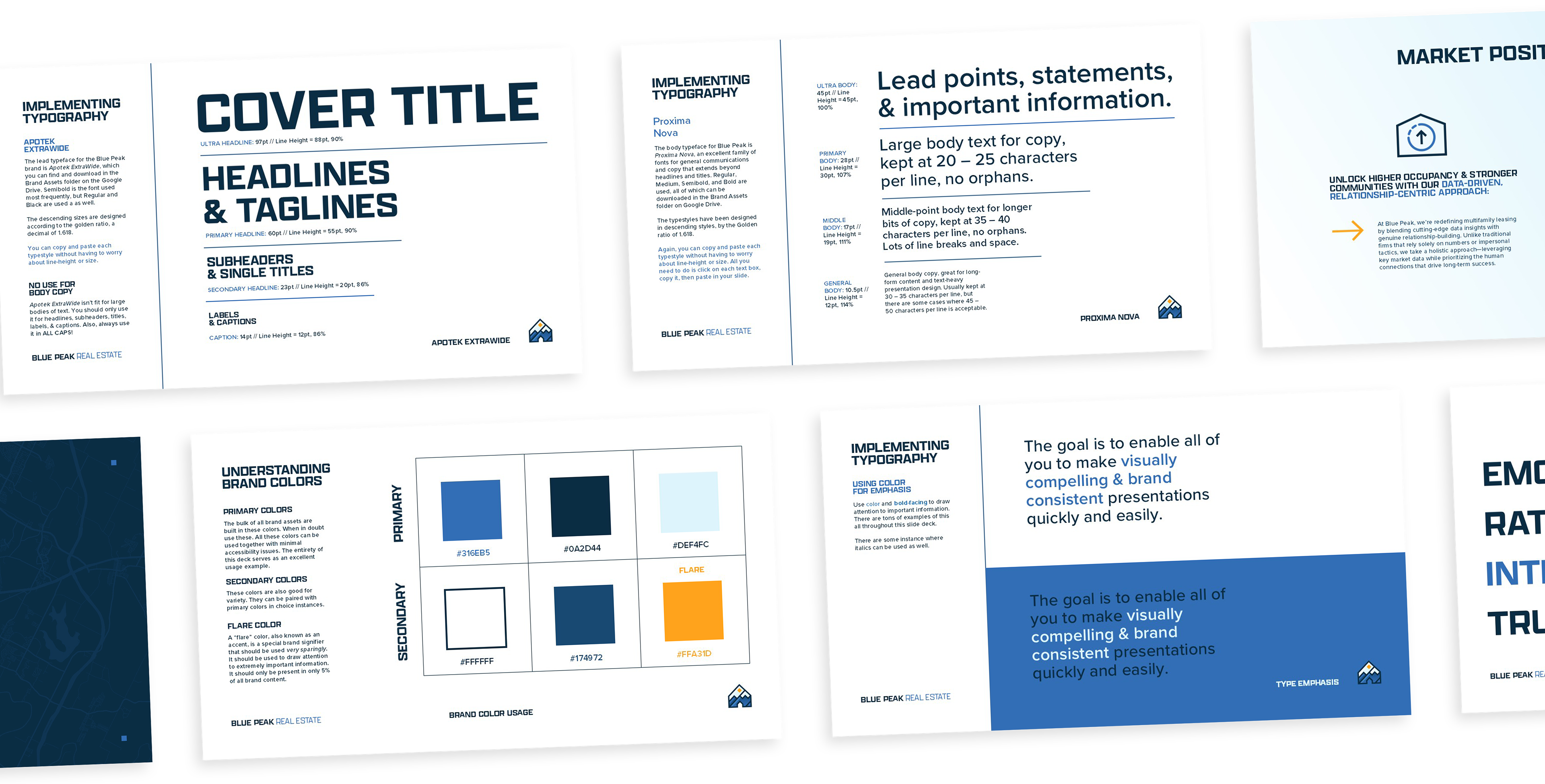

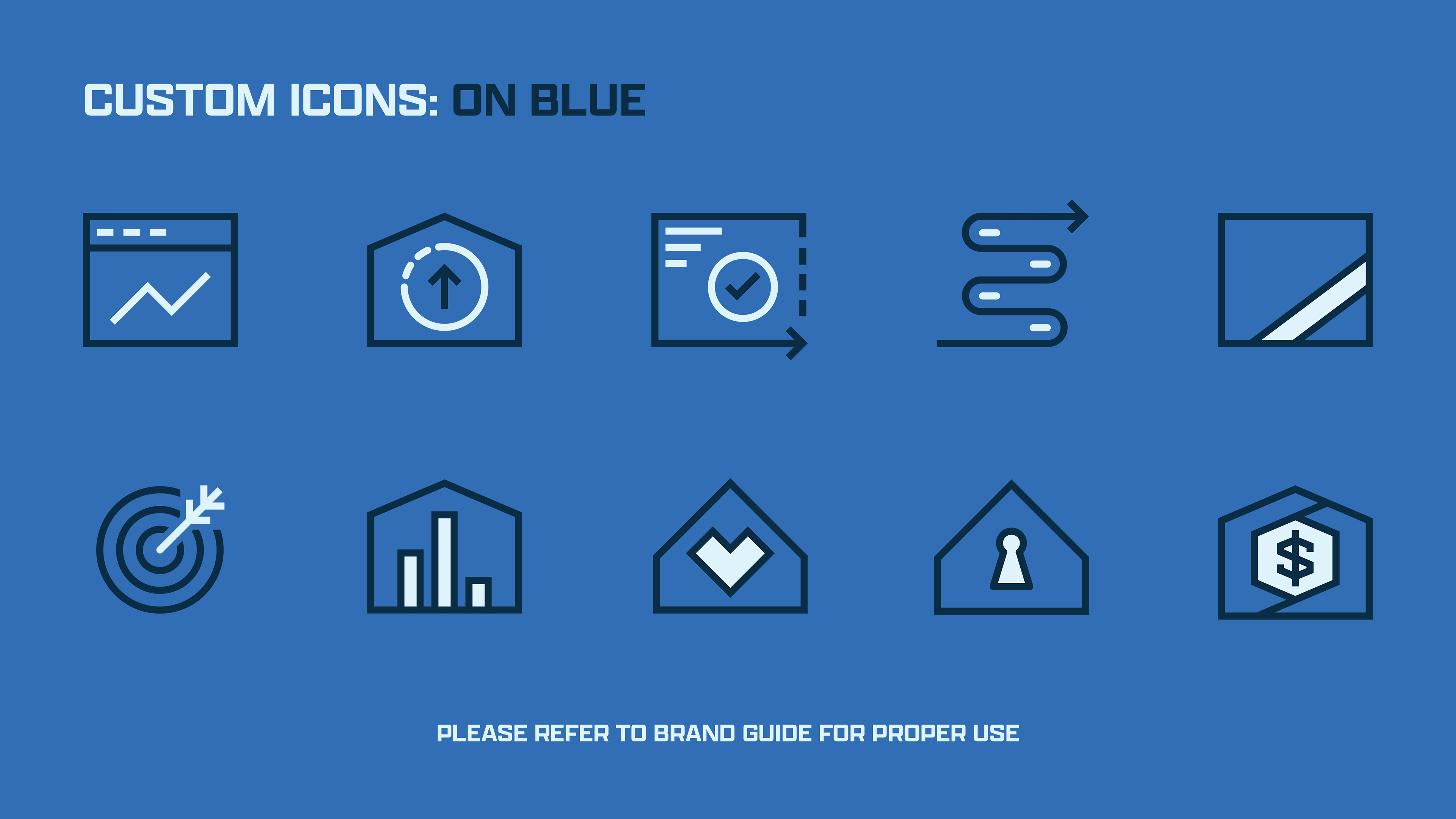
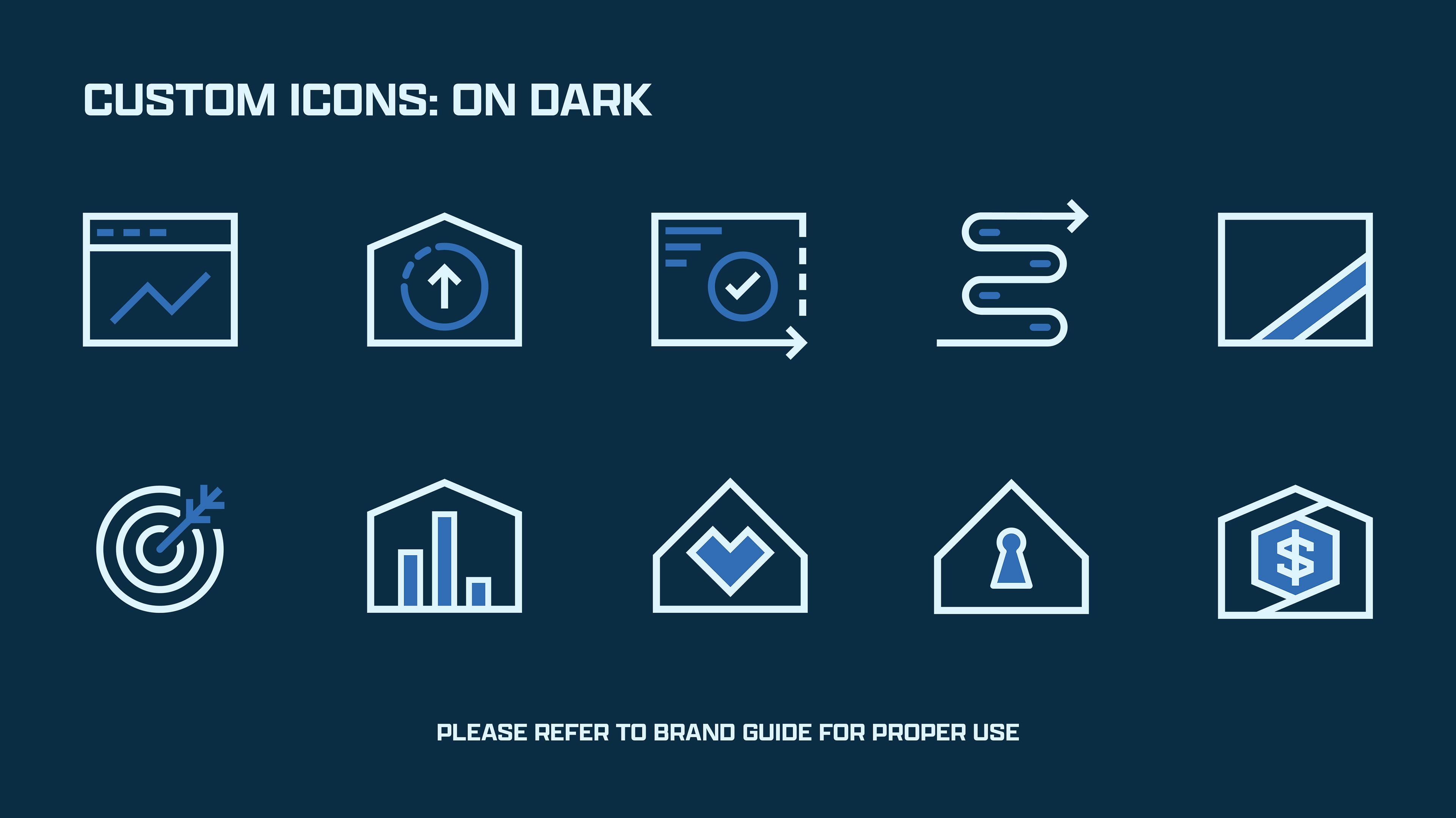
VISUAL IDENTITY & LOGO DESIGN
TURNING THE LIGHTS ON
FINDING THE VISION
In the beginning, Blue Peak Real Estate knew little of how to present themselves, beyond a hastily generated AI logomark. The firm had no brand position, no sense of voice or mission, and was devoid of any outward-facing vision of how to present themselves in a highly competitive marketplace.
Ben's task was simple: study the competition (digital brokerages & leasing technologies) and develop a visual identity that breathed warmth and trust into an otherwise cold, outdated, and mechanical industry.
THE LIGHT IN THE ATTIC
Ben decided to establish an element of empathy and humanity within the brand. In the increasingly intangible landscape of digital technology, renting and buying real estate-- one of the most personal and important decisions someone can make-- should feel friendly, comfortable & personable.
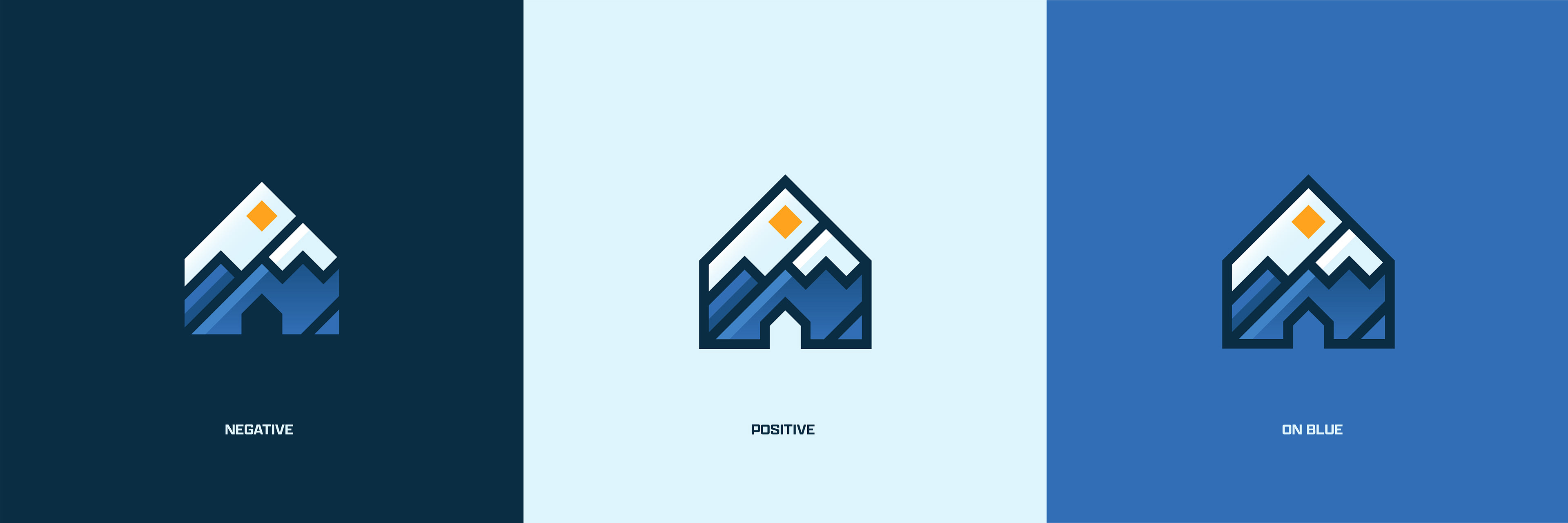
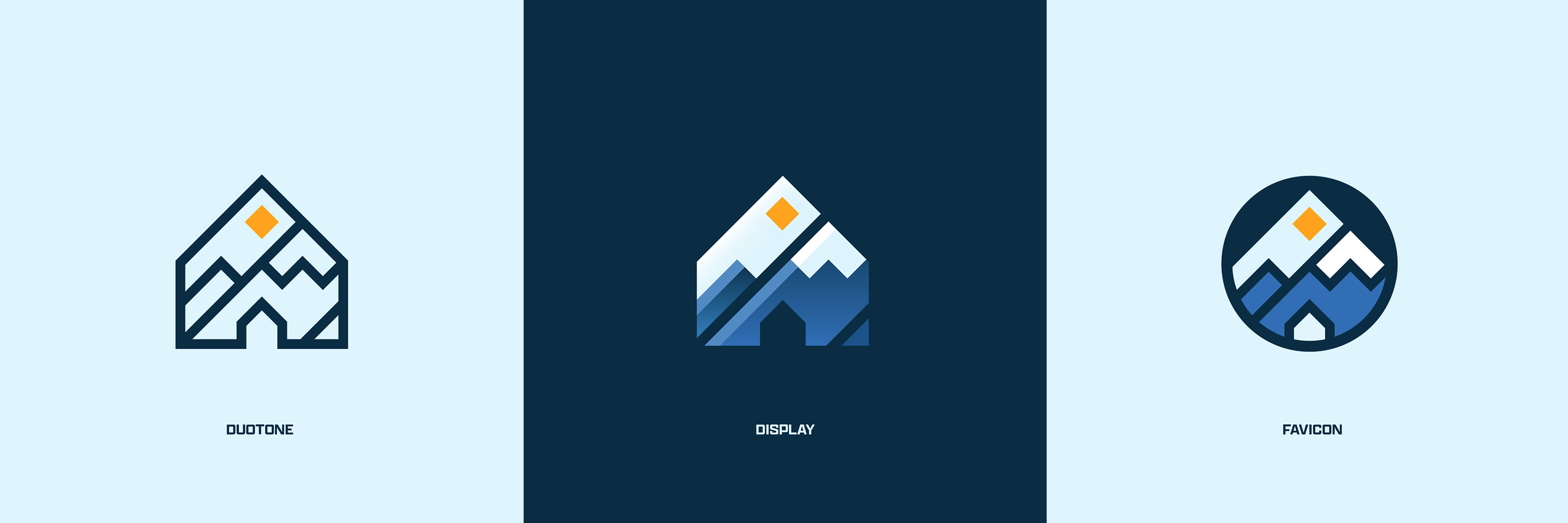
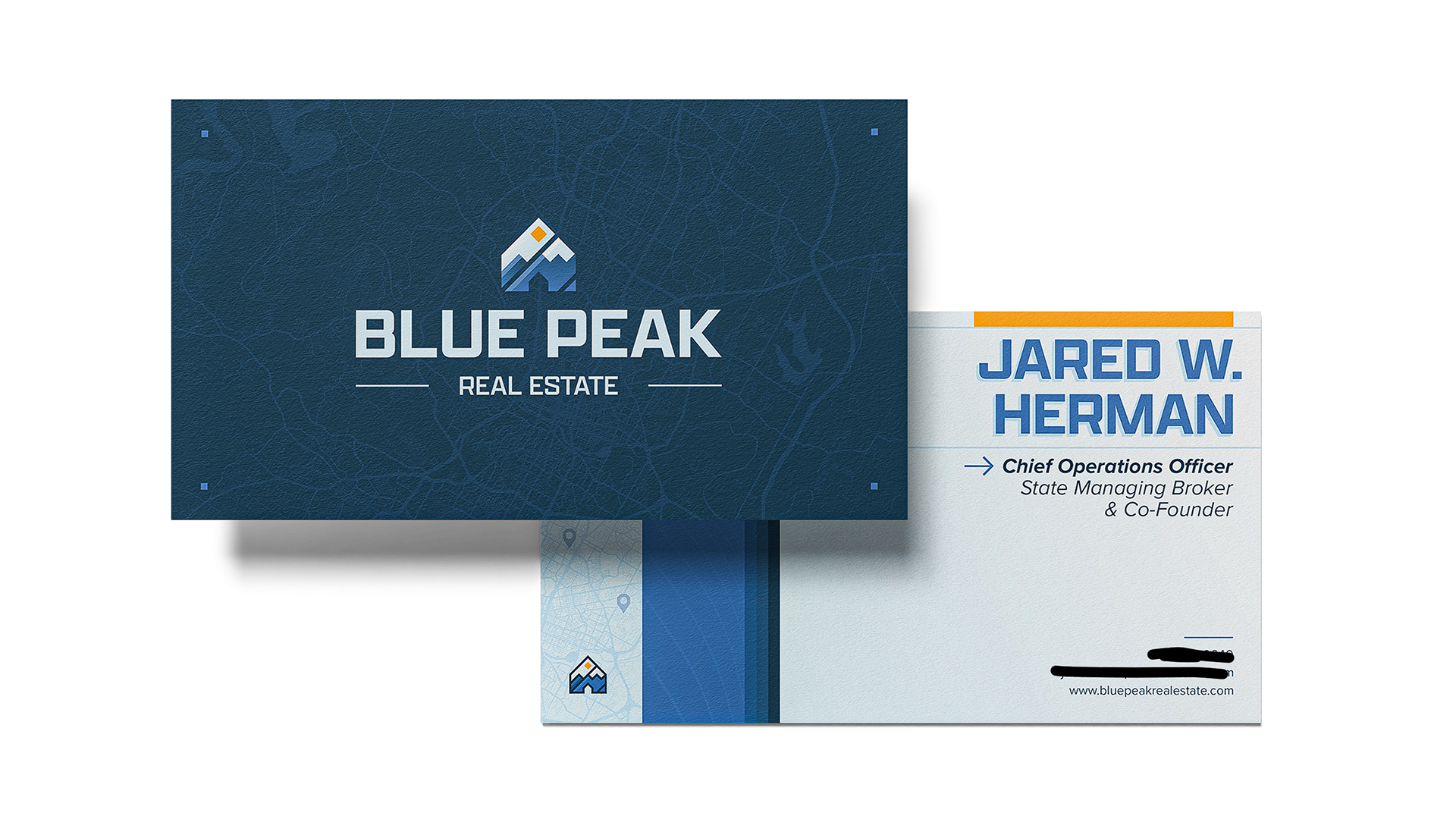
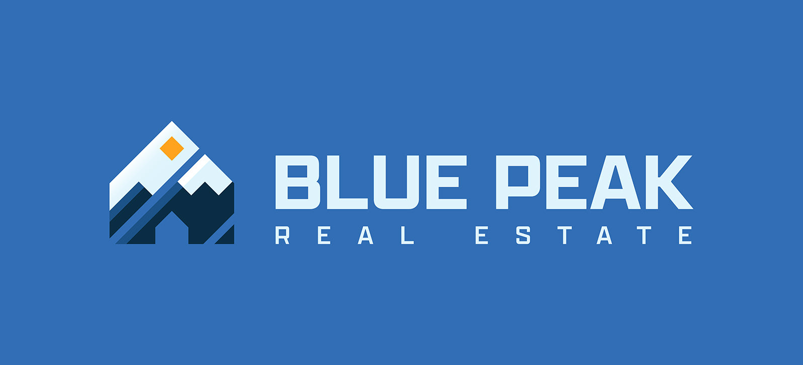
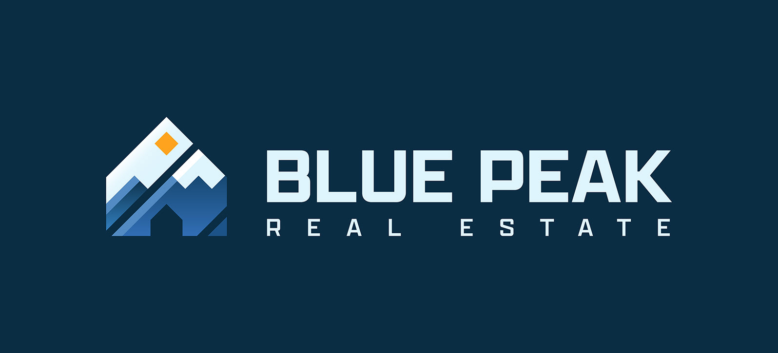
In direct contrast to the cool & trusting blue of the company's namesake, Ben insisted on introducing a warm orange as a brand signifier of the company's message and mission. This is creatively represented in the company's brandmark as both a rising sun and the glowing light inside the attic of a home.
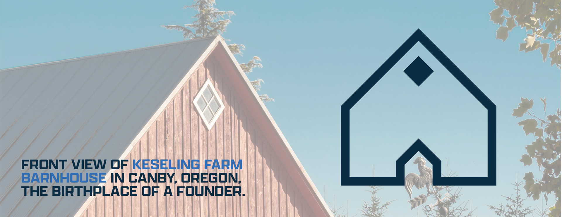
A STORY BEHIND THE BRANDMARK
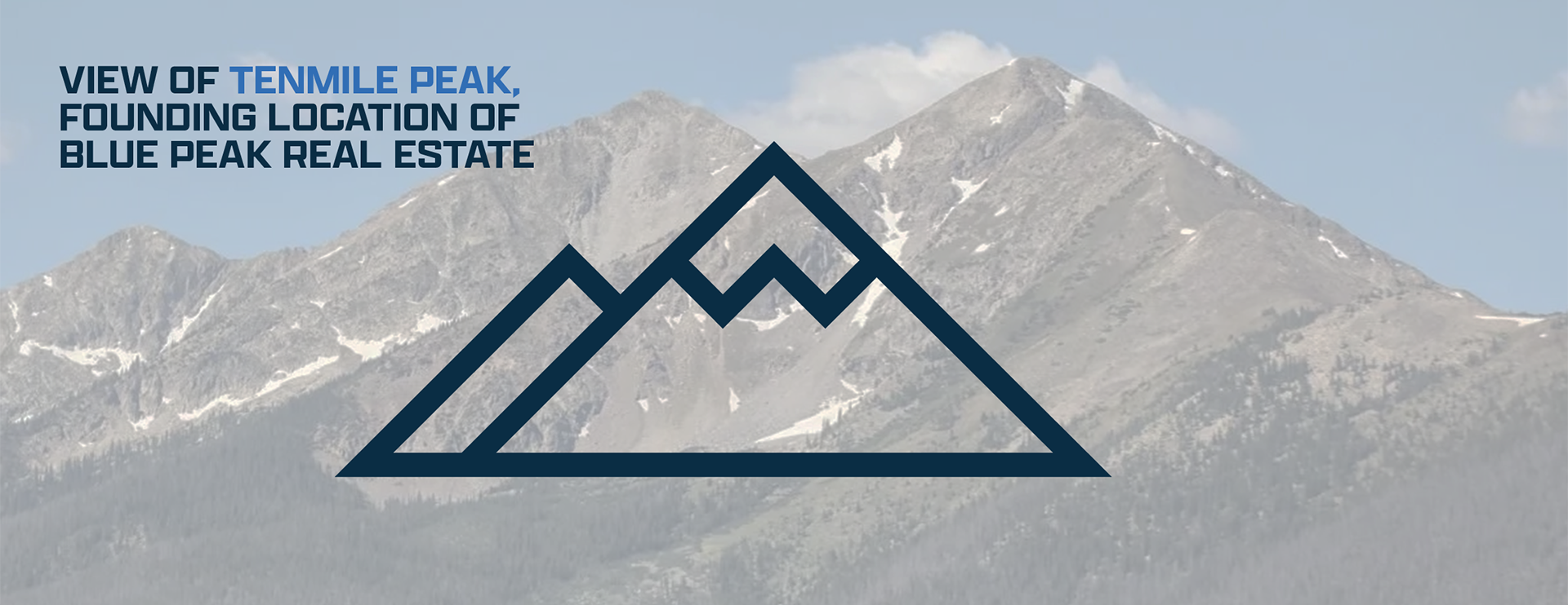
Blue Peak Real Estate was named for a specific vantage point of Tenmile Peak through the founders' living room window in Dillon, CO. On a bright winter afternoon, the mountain loomed sharp and blue in the distance, while they coded the first foundations for their tech platform.
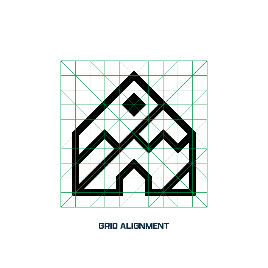
Using that moment to inform development, Ben moved in a very literal direction when designing the brandmark logo. Sketching a simple snow-capped mountain vista, he fused the scene with the front of an Oregon farmhouse, where one of the founders spent his childhood, notable for its famous diamond "witch window"-- further reinforcing the importance of home and family for the brand.
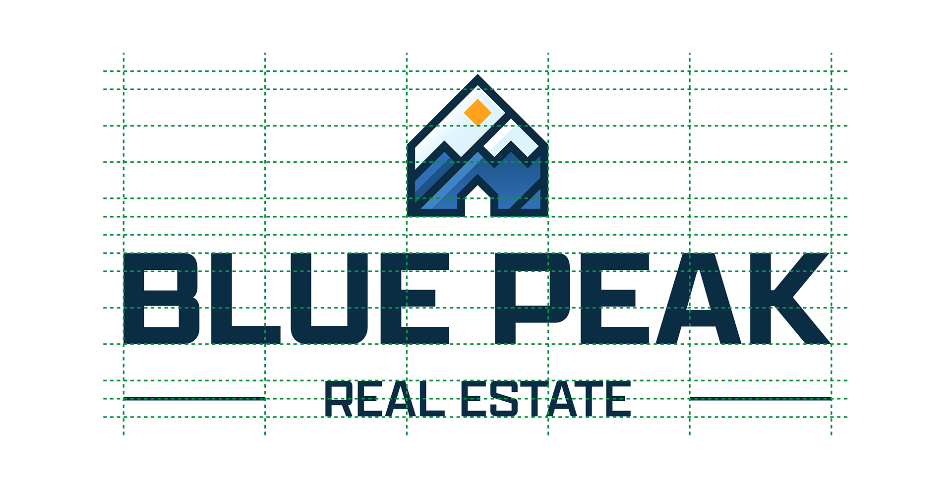
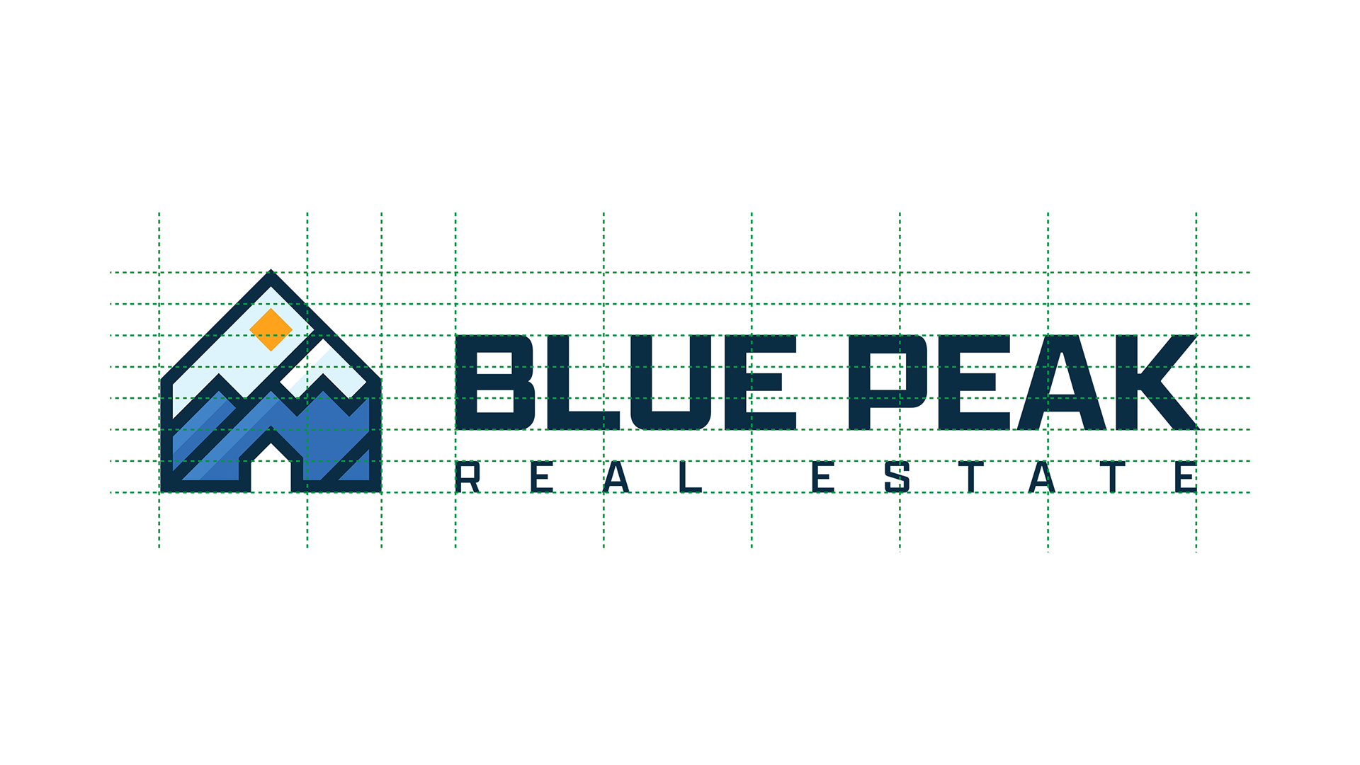
WORDMARKS & LOCKUPS


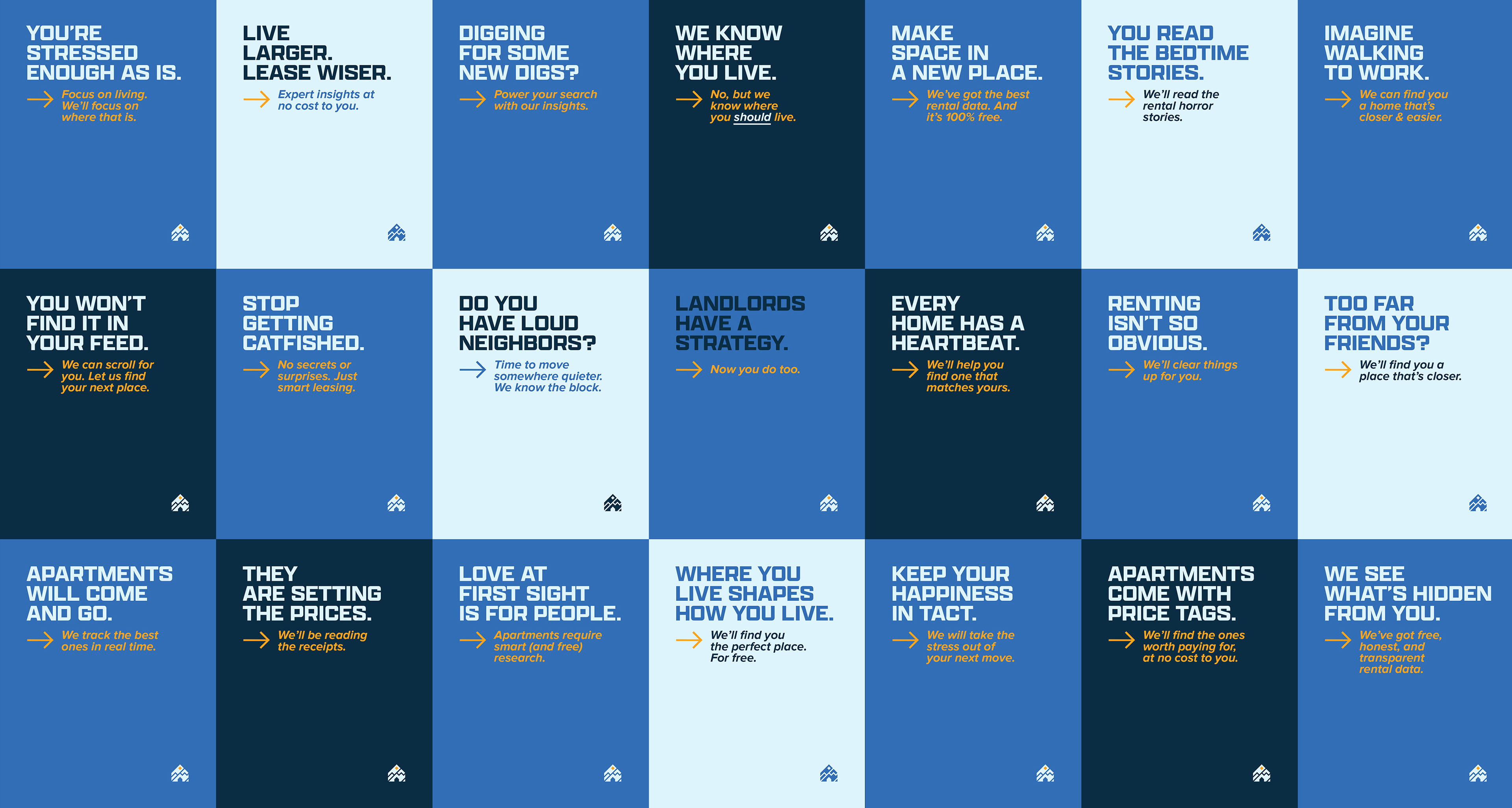
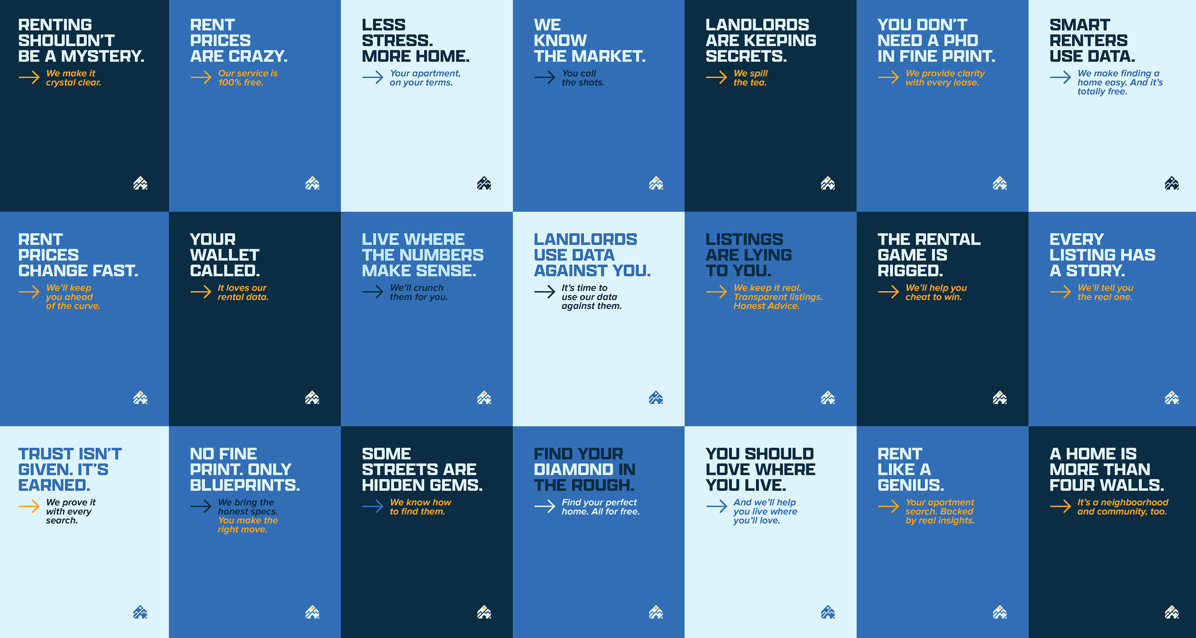
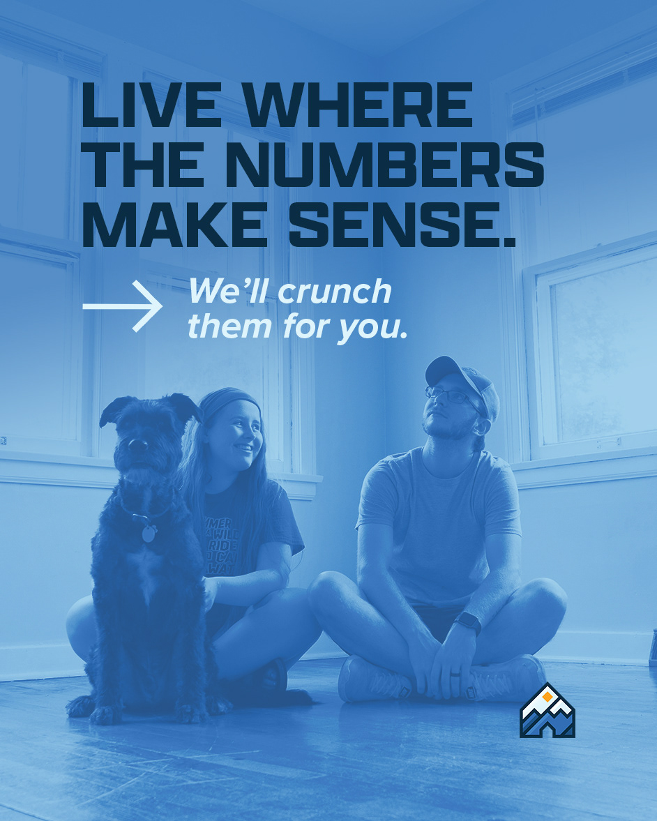
MARKETING & AD STRATEGY
FUSING EMPATHY
WITH MARKET INTRIGUE